Project Overview
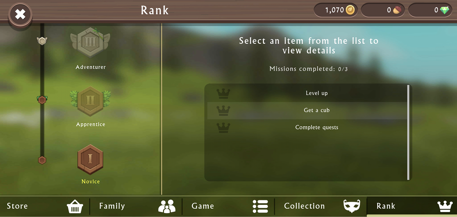
During my onboarding period at Sprung, I was tasked with evaluating the UX of a mobile game, identifying potential player pain points, and create low-fidelity wireframes to suggest solutions. The game I evaluated was WildCraft: Animal Sim Online. Specifically, I focused on the game's Rank screen.
Evaluating current state: Requirements & Potential Issues
My approach to evaluating the user experience of the Rank screen was founded on leveraging conventional UX principles, like Jakob Nielsen's 10 usability heuristics for user interface design, as well as Celia Hodent's The Psychology of Video Games.
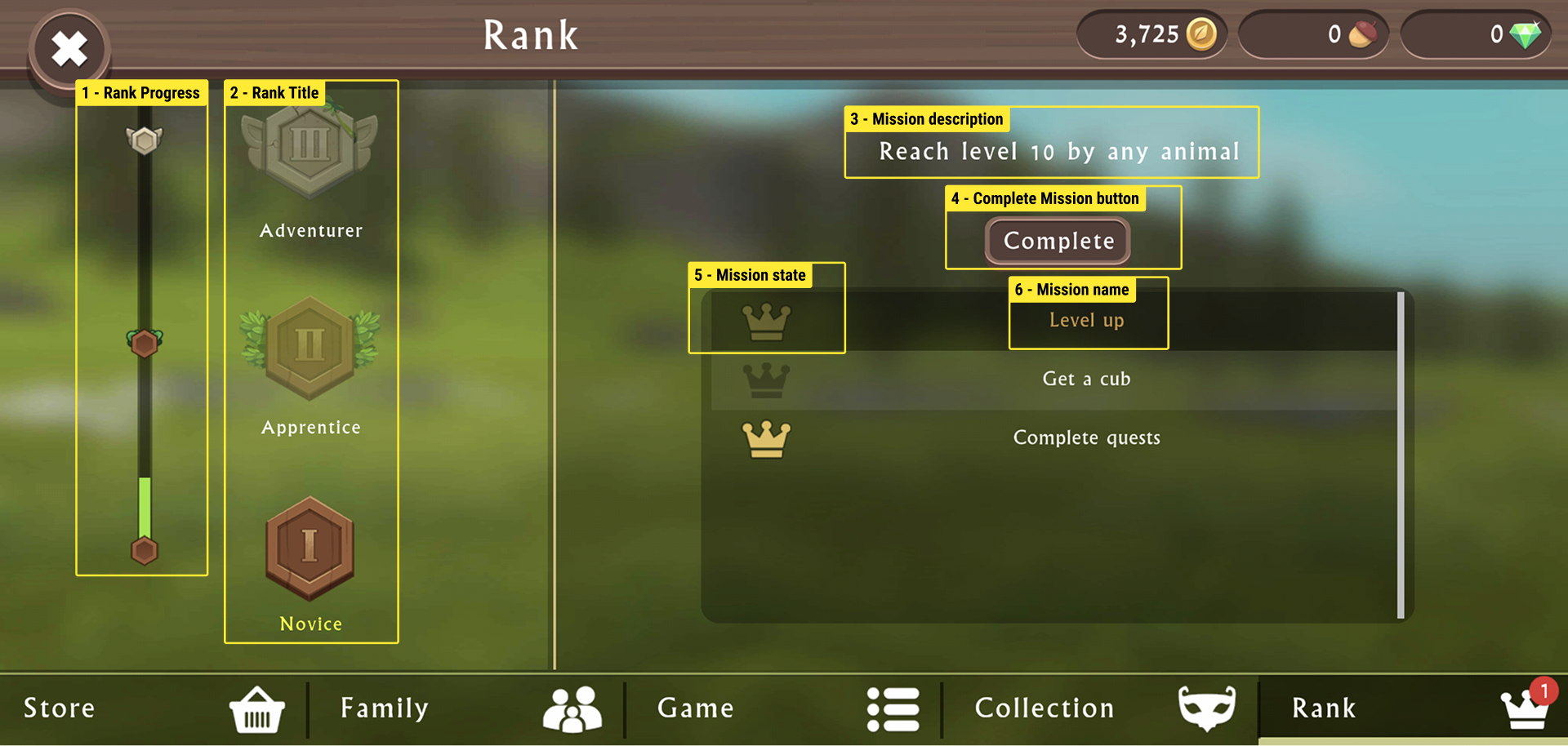
Identifying required features, information, and hierarchy
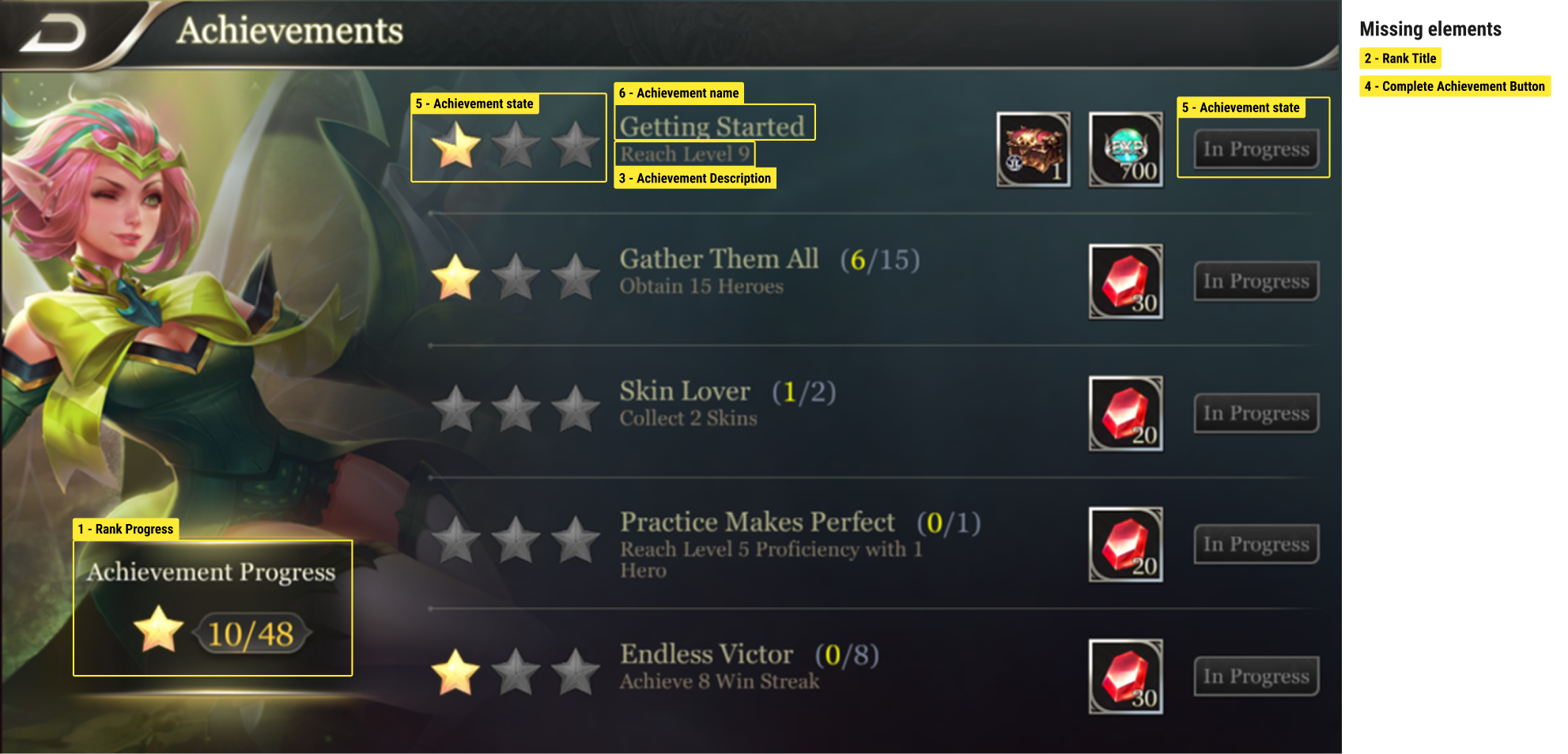
Highlighted on the right are 6 key pieces of information that needed to be kept in my redesign.
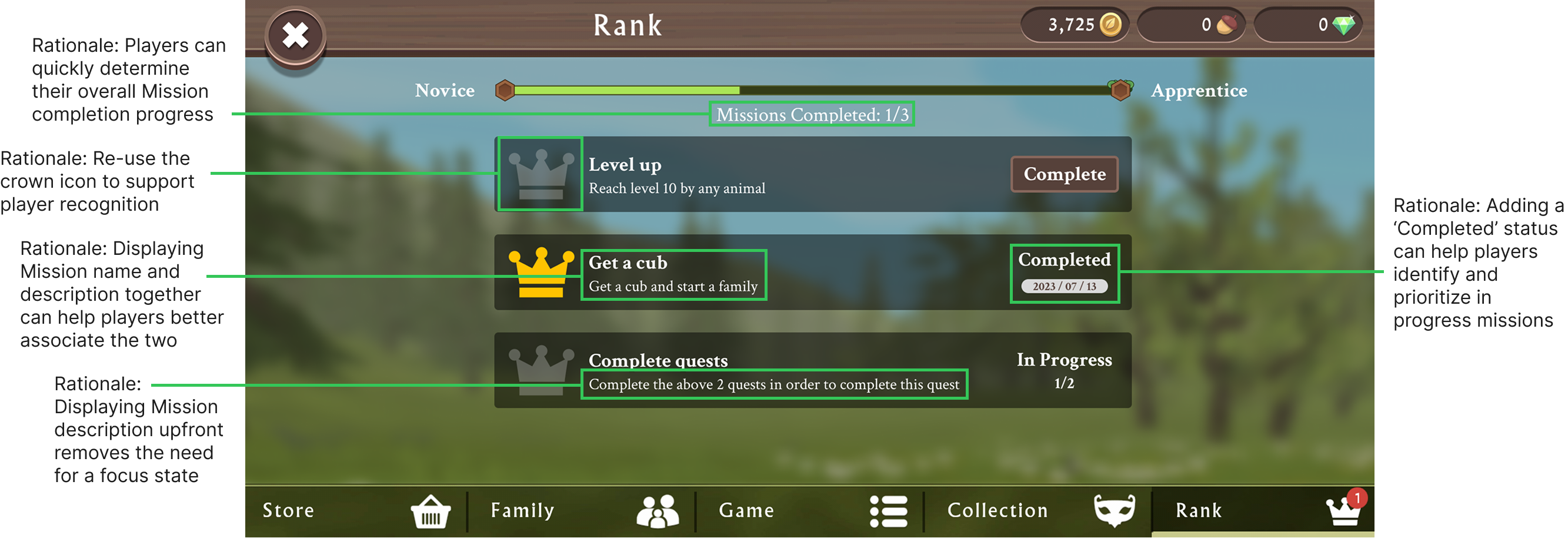
Below, we can see potential player issues through the lens of UX and accessibility.
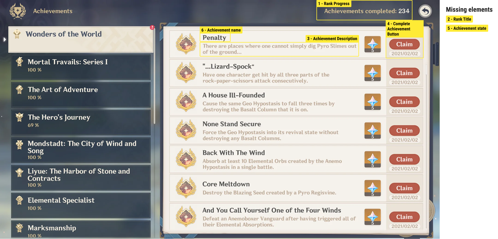
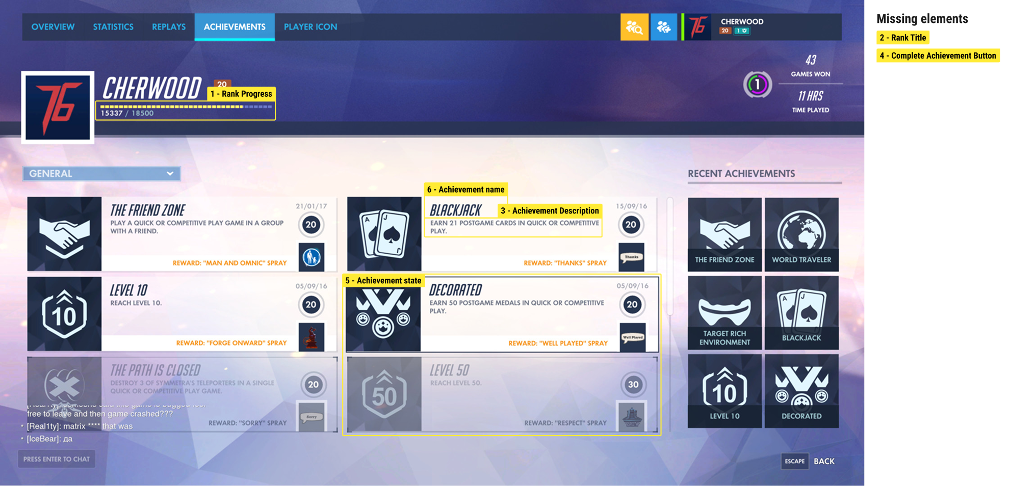
Competitor analysis: Trends & Potential Solutions
1. Achievement name is displayed close to Achievement description.
2. Display achievement progress to motivate players.
3. Displaying completion date is a “nice-to-have”.
Design proposal and mockups
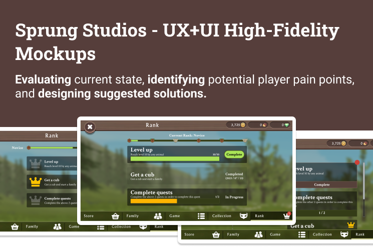
I designed 3 high-fidelity mock-ups to address the aforementioned issues. The top and bottom banners were out of scope for this particular assignment.
Option A:
The goal for Option A was to go for a design that would remove the need to tap on a specific Mission to read the Mission's description, but still felt familiar to the original UI.
Option B:
With Option B, I wanted to explore a more noteable difference in Mission states, specifically highlighting the player's progress towards mission completion.
Option C:
Option C was the most similar to the original UX layout, but improved the legibility of Mission tiles.
Jumping straight to high-fidelity mockups
This onboarding exercise was a really fun opportunity to brush up on the design skills I had learned in undergrad and in my various design co-ops. It was especially refreshing to be able to apply UX principles to video games, as this was something that was fairly new to me at the time. In my previous roles and experience, I focused primarily on UX for websites, web apps, and mobile apps. After some time had past, I revisited these proposals and used Figma prototyping to add interactions and visualize a realistic player experience!
